UX Is Not UI, What Is the Difference between UX and UI Design?
UX has been a buzzword that bounces around the design world, endorsed and adopted by designers anddevelopers. In many cases, highly respected developers who claim to be talking about ”UX” in a product demonstration are in fact showing a large number of UI features. I doubt much that the vague definition may account for this kind of misunderstanding. We’ve heard of UI (User interface) and UX (User Experience). When you build an App or a website with Mockplus, we will talk to you about both. If UX is not UI, What is the exact difference?
The Definition of UX

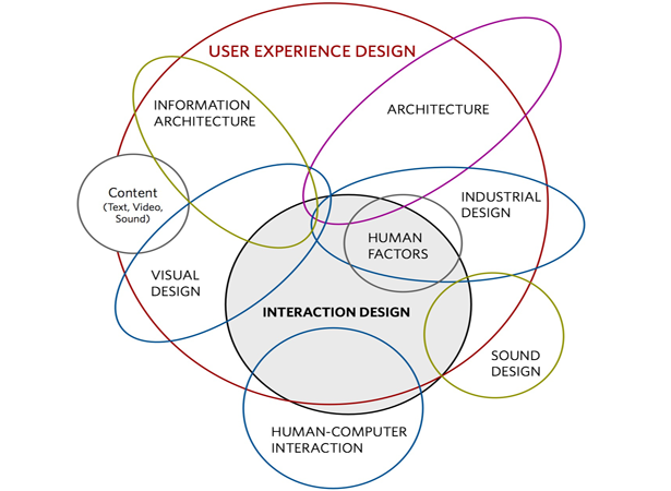
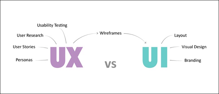
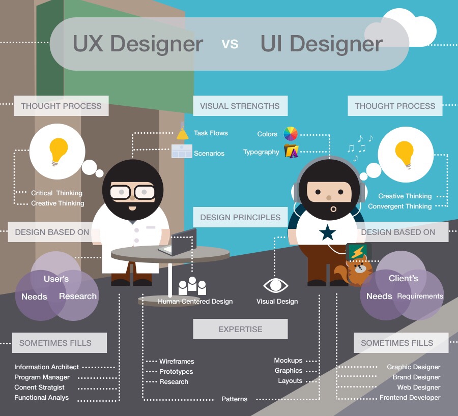
UX is not UI, then what is the definition of UX exactly? Here I am not going to shoot the cliche but to provide you with a intuitive introduction which will help you to get a quick understanding of why UX is not UI. Good UX designfocuses on the interactive side of the product, how it behaves, such as a box sliding out, and how people might interact with it, such as where they will click first. UX handles the architecture of the content and the site map.
If you take a deeper look into the definition which is now gradually formed in your mind, you might have noticed the simplest difference between UX and UI. We all enjoy using UX as a prevailing buzzword, but if you are talking about how the page is physically laid out, where things should go, what colors to use or something like that, let’s accept the fact that they are UI things and UX is not UI.
The Definition of UI

To get a better understanding of why UX is not UI, UI is a small part of UX to some extent. However, UI design focuses more on colors and typography. Let’s pick a textbook example. If there need to be a button, UI designers will concentrate on the visual part. Namely, how the button will look like and what color to use, whileUX designers are trying to figure out where to put it with the intention to find what users want and the resolutions to those pain points. So next time if you hear something like “building great user experiences with Silverlight 4” or“Mastering HTML5, CSS3 and Jquery to implement stunning user experience”, you can just laugh it off or boo them if you want to.
The Vomit-flavoured Lollipop Problem
There happens to be an interesting argument attempting to trivialize the difference between UX and UI: If you are selling shit-flavoured lollipops, will the best experience design in the world save you? My short answer isYES.

Here is the long answer. Last year I came across an operating system claiming to be the best OS on the Eastern Hemisphere called Smartisan OS. As might be expected, I bought the phone and found it just a piece of shit. The system crashed whenever I ran more than 3 Apps and the heat of the hardware could burn off my hands. Nevertheless, some user-friendly designs in Smartisan OS did amaze me, such as the contacts searching system and tricks like timed mute options. These details combined to win the company 60 thousand users in the intense mobile market in China.
What if We Just Enjoy Using the Buzzword (Though We Know It’s Inaccurate)
Buzzwords are tempting. We all get the sense of superiority of being professional by using the catching words but sometimes the singing Siren kills. Trivial misunderstanding like this is creating a mess in the employment process. Companies and talents all fuck up before their first meeting with each other. So please, if we want to look like professionals, we firstly need to act like ones- at least use the word right and admit that UX is not UI.
by Devin
评论
发表评论