10 Flat Web Design Examples Tells the Flat Design Being in Disgrace
In recent years, the design style has been changing. Regarding this, the designers with different preferences and tendencies keep discussing and debating on web design trends for a long while. For example, Flat design vs. Material design. But our topic today is not the comparison between the two terms but learn some great flat web design examples to give you inspirations.
Before the learning on flat web design examples, you should get a comprehensive understanding of what is flat design. According to the authoritative explanation on Wikipedia: “Flat design is a minimalist UI design genre, or design language, commonly used in graphical user interfaces (such as web applications and mobile apps), especially in such graphical materials as posters, arts, guide documents, publishing products.”
In 2008, Google initially adopted the definition of Metro Design, and later on, they changed the name to Flat Design. However, the name, “Flat Design”, is a controversial term that even has not been fully recognized by everyone.
From the very beginning, the flat design is affected by The International Typographic style, and it emerged and got popularization during the 1950s and 1960s. This period is regarded as the starting point of flat design, although it would not make an appearance in the digital world for some time thereafter.
In 2002, the flat design element has been contained by the Microsoft’s Windows Media Center. In 2006, the Zune MP3 player also included the elements of flat design. The design of the Zune was clean and simple, with a focus on large lowercase typography, silhouette-style logos, and monochromatic font colors. In 2010, Microsoft still kept flat design style with the release of Windows Phone 7. The bold large and bright shapes, sans-serif typography, flat images, and a menu with a grid-like pattern appeared at this time. Likewise, the later Windows 8 operating system also continued the flat design elements by using the crucial elements of flat web design, such as the bold colors, simple typography, long shadow and ghost buttons. In 2013, Apple released iOS 7 which featured the flat UI design elements instead of skeuomorphic design.
From the aspect of pros and cons of flat design, designers have their own opinions.
Advantages:
1. Reduce the hardware requirements of mobile devices, and extend the standby time;
2. Can directly present the information and things out in a simpler way, which will help to reduce the cognitive impairment;
3. With websites and applications that cover more and more different screen sizes on many platforms, creating skeuomorphic designs with multiple screen sizes and resolutions is cumbersome and time-consuming. The design is moving towards a more flat design, and you can guarantee that it will look good on all screen sizes at once. Flat design is more simple, clear, the most important thing is that better adaptability.
Flat design opponents think that:
1. It will reduce the user experience, and it’s offensive on the non-mobile device;
2. It’s unintuitive, and needs certain learning costs;
3. It cannot convey the rich feelings and even too cold.
Flat design can be seen everywhere in our daily life, such as Apple’s mobile phone. By the using of angular lines, plus some of Apple’s application design interface, monochrome contrast, the design is very beautiful. Here Mockplusteam selected some of the great flat web design examples for your reference. Hope these examples will give you some inspirations. Any other designs for the recommendation, please feel free to give a comment below the article.
Space Needle

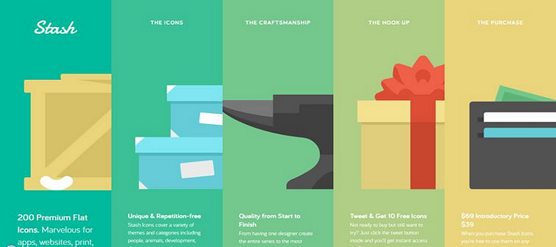
Stach Icons
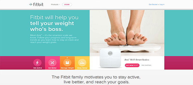
Fitbit
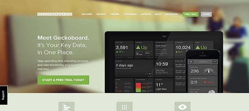
Geckboard
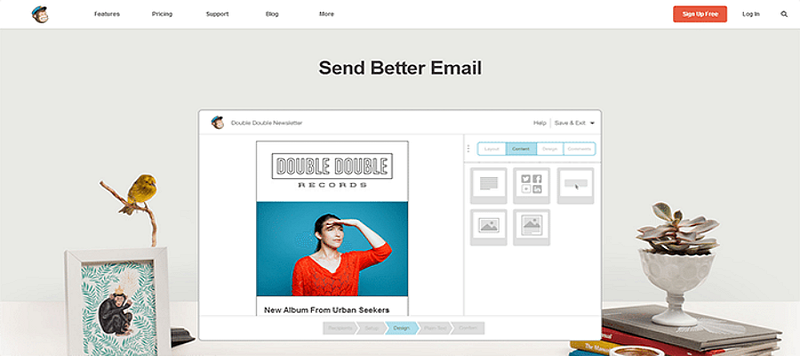
Mailchimp
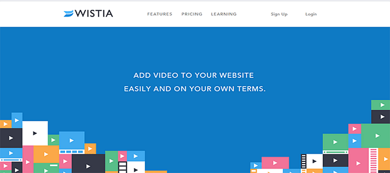
Wistia
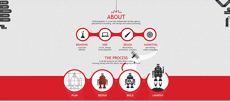
Chilicon Graphic
Numbrs

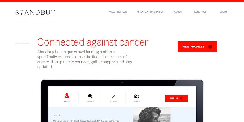
Standbuy
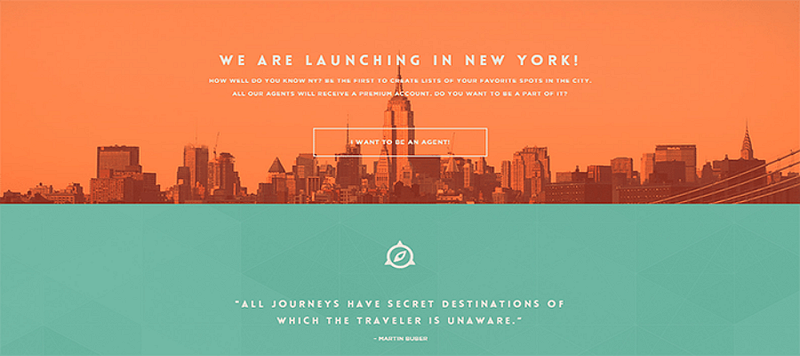
Triplagent


评论
发表评论