18 Practical Websites Homepage Design Tips and Excellent Examples
Wikipedia defines a homepage as the initial or main web page of a website or a browser. I guess the word “initial” or“main” says enough significance already. The situation can be really ironic sometimes: websites designers wonder why visitors leave your homepage so ruthlessly, while users feel disappointed even at the first glance on your homepage. The bridge between designers and users seems destroyed. So my intention in this article is to rebuild the bridge by providing useful materials - 18 practical websites homepage design tips.
First, what a homepage can do?
Once you set a goal, you’ll see what to do more specific and clear.
1) To attract and appeal visitors;
2) To “stick” visitor on your site and deep deeper on yourother page;
3) To enhance business or cooperation;
Second, please follow me to check the 18 practical homepage design tips:
1. Display your identity clearly
Do not exceptvisitors to explore who you are and what you can offer. Use text (headline andsub-headline) and visual parts (images or logo) to show your identity clearly.Your homepage should tell the visitors immediately if they have got to theright place. Remember: Confusing means leaving.
2. Make usage on multiple devices
This is simple to understand, you must have check your Facebook feeds on a mobile phone. Since we are also in a mobile world, you’d better make sure your homepage design can works just perfectly on any different mobile screens. have a better understanding of responsive web design is necessary.
3. Set useful links and compelling CTAs
Links is to help users get to relevant information and the listed call-to-actions is to direct visitors to the next step. You may consider buttons like "Free Trial," "Schedule a Demo," "Buy Now," “download free,”or "Learn More." Keep the CTAs above the fold. Do not let your visitors get overwhelmed or lost.
4. Target your users
Your target users are the main source of your market, those who happen to find your homepage will finally hit the “back” button. Do not try to hook all visitors to dig deeper into your site. It won’t last long and your matched users may turn to your competitors instead. Do not feel sorry for your homepage is narrowed or limited. Focus on your user, choice the right language and emotional color.

5. Keep test and remain updated
Test is the best way to check all the changes and make your homepage live on the right moment.It is more than one of those homepage design tips that achieve continuous progress and maintain latest update. Stay in changing so you can get the needs,requirements or feedback from visitors. Just keep the text, the content, the images, the information current and in. This is also a good way to build trustworthy and follow the design trends.
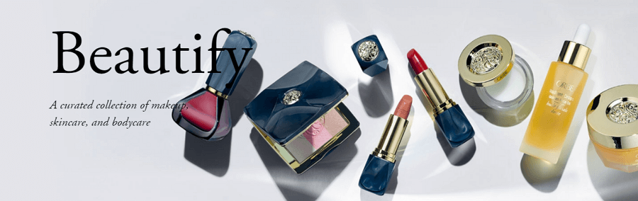
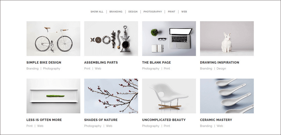
6. Use high-quality and matched images
Images can show directly who you are and what you do. Try to use your own unique images. And if you are trying to sell something, I suggest you put the real product image. Moreover, the images should work with the overall background color.
7. Adopt balanced color scheme
Color is the main visual part of your homepage. It can leave the first impression on your visitor. Besides,right choice of color can recall visitors’ emotion and recognition. If you area social website, blue is a good choice, if you are a site for woman, choose the female color like blue, purple, and green. Learn more about colors, please check at How To Use Color In UI Design Wisely to Create A Perfect UI Interface?
8. Abandon the sidebar
Nowadays, many modern homepage design goes to themes “without” sidebar. The same goes with Sliders, sidebar or slider may result in bad user experience by throwing too much information, cluttering the page and distracting from the content. Visitors just miss what they really care about. So just link to separate category or channel pages that will include subsequent information. There might have a misunderstanding about user experience design that users actually don't need too much information.
9. Make it simple and keep the white space
Get rid of all those unnecessary clutter or dazzling pictures, videos, photography and colors.Stick to the high-quality one and keep the white space. This can emphasis the core information and keep a balanced design.
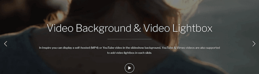
10. Set a featured video (it depends on the category of your site)
Video can serve a powerful addition to your homepage. People like animated things, especially the nice and exquisite one. With a tiny video can introduce who you are all about clearly and make connection easier. But it depends, It is better to keep your website clean rather than including things that are not useful.
11. Optimize load time
Nobody enjoys waiting in front of a screen. Make your homepage load faster can present a better user experience. Also, it can bring extra benefit like optimize SEO of your site. For example, optimize your images or pics.
12. Display social proof and user feedback
It can be a great proof to build trust and inform your visitor you are reliable and responsible. Using logo to show who you are work with, media exposure you have had. Or you can use customer success stories, customer testimonials or quotes, professional accreditation to create trust. But do not put it above the fold.

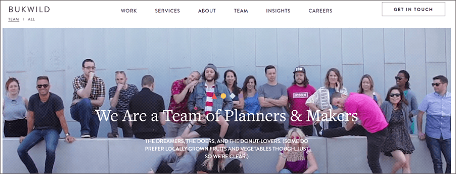
13. Involve your corporate culture
Every product behind is a story. A good homepage is a reflection of your team, your intention to achieve something, your social value and your psychological environment. You may add your team members photos or videos. I believe those factors are integral part of your overall design. So just nail your value proposition.
14. Blog and features highlights (promotional)
Blog can be a good help to present your value proposition and also a amazing strategy to promote. Just add a section with thumbnails from recent posts to promote your blog on the homepage. But this is also depend on your site. Beside, a features list can help your potential customers know what EXACTLY they are getting when they make a purchase. List out your most compelling features that your visitors will want to have.
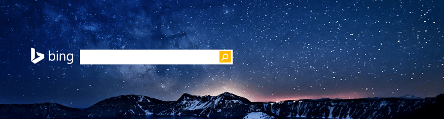
15. Add a search box
It’s not anindispensible element, but you really should for most occasions. A search boxcan help visitors quickly find what they want on your whole site.
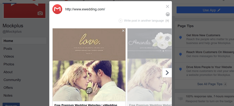
16. Attach afeatured image to your homegape
A featured imagecan help visitor to link or share your homepage. It’s for your won good togenerate a matched thumbnail image when your homepage been shared. Or you can makelogo or an avatar pops up alongside your link.
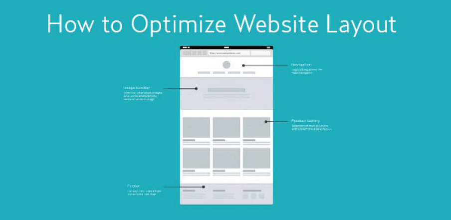
17. Hues and navigation
Display directional cues and navigation. Clear hues and navigation can guide visitors to follow your design to explore the site. Moreover, visitors may ask for help or start a contact when a problem occurs or a business request is happened. So use arrows or images to help the user's eyes naturally flow from one section to another on your homepage.
18. Typography and font
There are plenty tons of beautiful fonts available nowadays. A good-looking font can beautify your interface and make the text easy to read. Sans serif fonts (Helvetica,Arial, Tahoma) are easier to read online than serif fonts (Times New Roman,Georgia). While a good content layout should arrange headlines, bullet points,ordered lists, tables and shorter paragraphs I good place. Also, limit the amount of copy to two or three lines maximum.
Thirdly, homepage design tools can be helpful to create a homepage.
The above 18 homepage design tips in all is a big help, and with the useful design tools, you can work like a charming.
1)Mockplus
Mockplus is a wireframing and prototyping tool with multiple functions. With simple drag-and-drop, you can create rapid low-fidelity wireframes. You can design your unique webpage by the rich components and interactions. You can start with an empty iPhone app or responsive website template, where you design everything in the app. Or, if you have a design you want to prototype and add interactivity, there are tools to import a project from or Sketch.
2) Sketch
Sketchhas gained a massive following since it launched in 2009. It is a professional vector graphics tool, which has bitmaps and a good page setup. It'll definitely do help to you web design.
3)Webflow
Webflowis a web-based app. You can design a homepage without coding. It has an simple UI and an option to view the design at popular breakpoints, and a preview mode, which gives you full control over the viewport size. There are some familiar tools that allow you to design elements, but it's all drag-and-drop (there’s no drawing tool) so you are limited with what you can create.
4)Macaw
Macaw was built with designers in mind, and without touching any code you can create responsive designs that look and work great across all devices.
Fourth, recommended five Homepage Design Examples:
Here I put together a list of 5 amazing website homepage design examples of various kinds of industries. Hope they can be an inspiration to help you design an impressive homepage on your next projects.
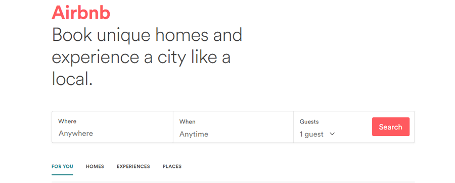
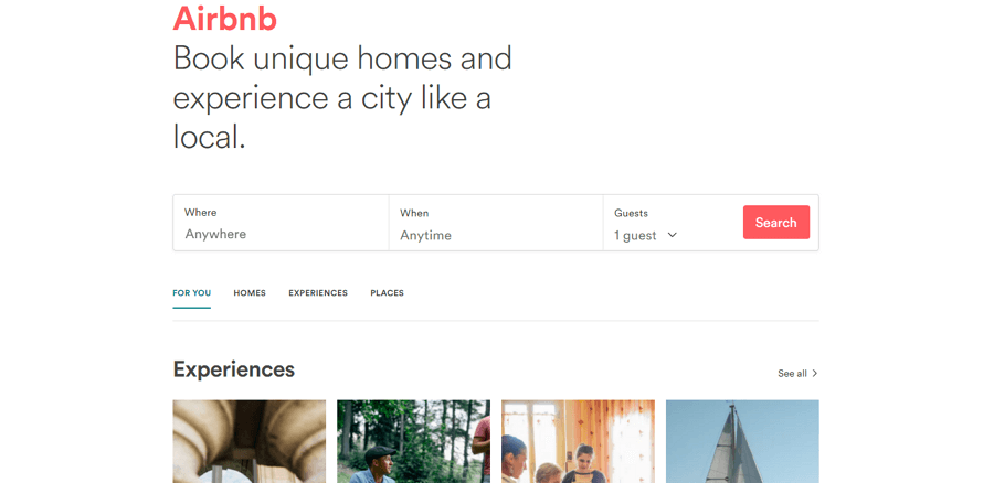
1. Airbnb
Tips: White space, functions, featured images and logo, search bar, etc.
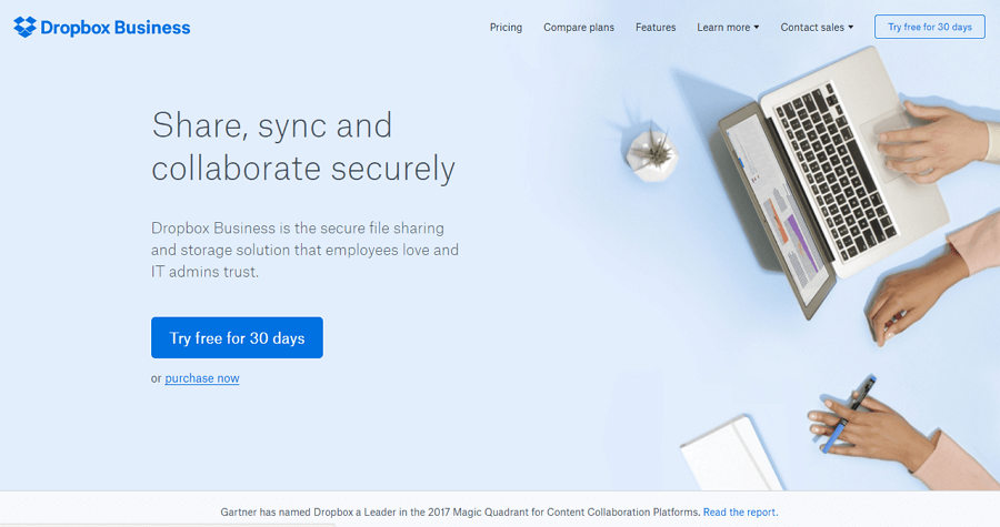
2. Dropbox (Business)
Tips: Blue color of the background and the main elements, high-quality images, main functions, navigation bar, appealing VCA, etc.
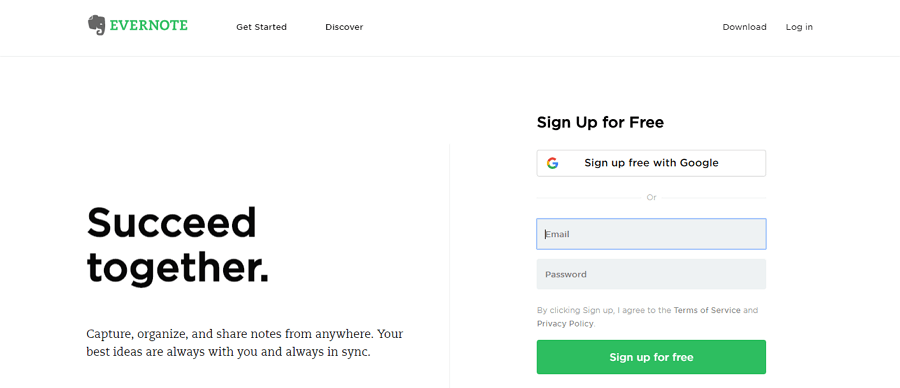
3. Evernote
Tips: White space, unique logo, useful CTAs, limited copy and eye-friendly fonts, clean UI interface, etc.
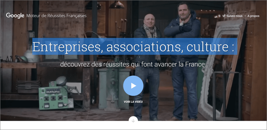
4. Moteurdereussites
Tips: high-quality videos, main functions and identity, selected language to target users, directional cues and navigation, etc.
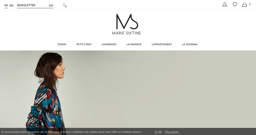
5. Marie Sixtine
Tips: high-quality and exquisite images, search bar, unique logo, directional cues and navigation, balanced color scheme, etc.
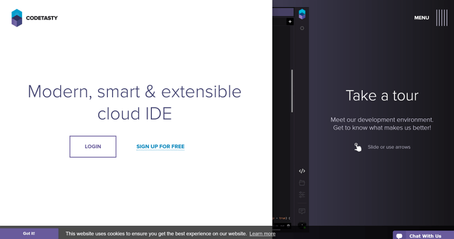
6. Codetasty
Tips: color contrast to create a appealing UI interface, unique logo, directional cues and navigation, etc.
A note: the above 18 websites homepage design tips may not so appropriate to all kinds of businesses. For example, the small business which just make their very first start and those giant brands with millions fans. However, not a homepage could talk big as it is perfect. So do consider those practical tips and find what works for you. Wish you get better and better.
More readings:


评论
发表评论