10 Latest and Best Food Mobile App UI Designs for Your Inspiration

Are You Looking for Latest and Best UI Design Examples of Food Apps?
In this age of apps, people can easily search, order and purchase a wide variety of delicious food online merely by downloading and using a good food mobile app with a few taps of their phone screens. So, such food mobile apps have greatly affected and facilities our daily lives.
However, as an app UI designer, the biggest problem is not about how to use them to facilitate your daily life, but how to customize a beautiful, comfortable and easy-to-use food mobile app design for a restaurant/hostel/cafe/fruit/beverage shop? Are you recently working on a food app, but still getting no any ideas yet? Or are you coincidentally looking for latest and best UI design examples of food apps to get inspiration? Here is a collection of 10 latest and best food mobile app UI design examples for you:
1. NomNom
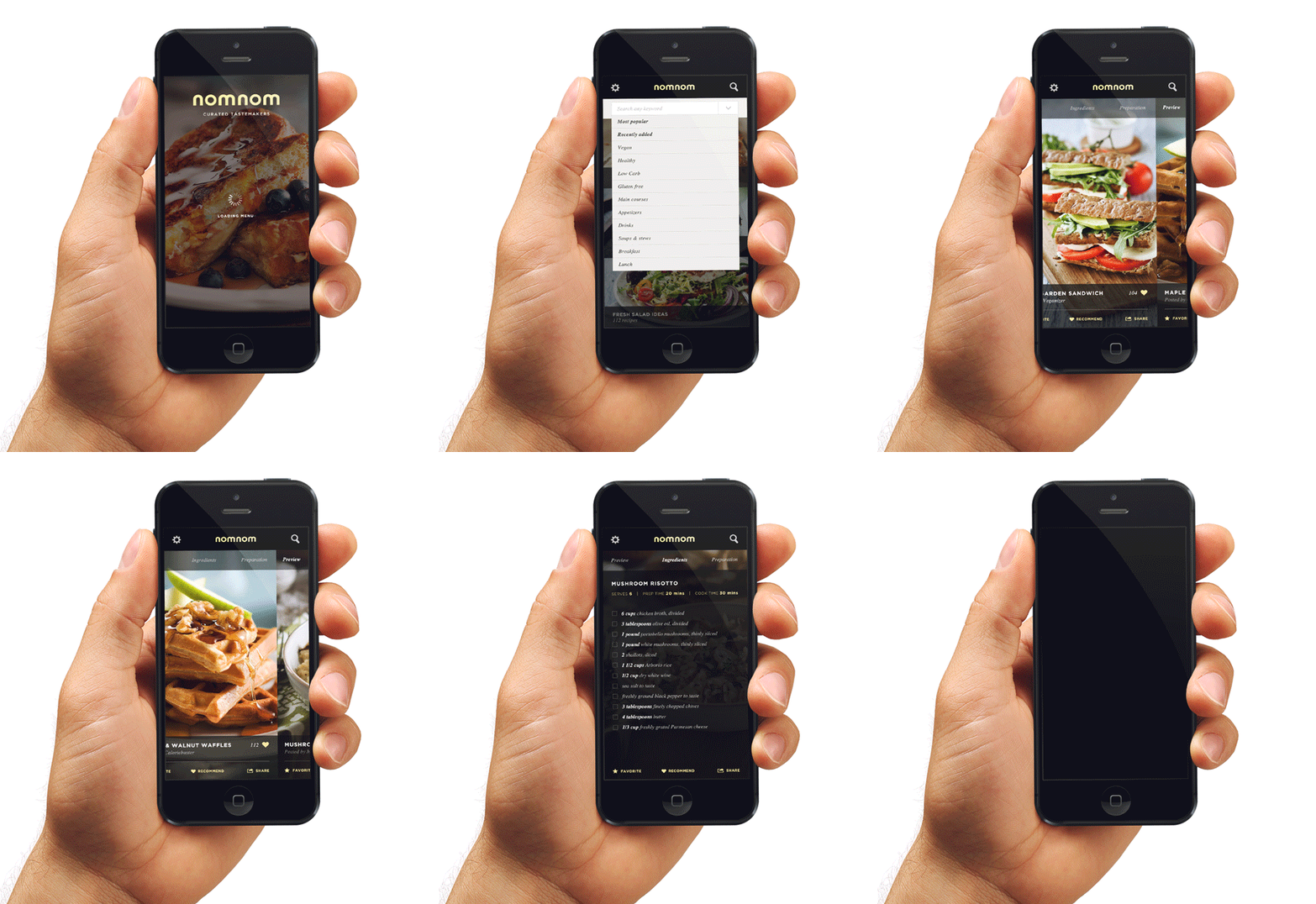
NomNom is a professional and beautiful food recipe app designed by Marc-Antoine Roy. In order to attract more food lovers to use this comfortable food app, the designer adds many useful and interactive pages/elements for them to freely explore, preview, learn, save and share preferable food dishes/recipes with ease.
For example, the designer has created a smart and powerful Search Bar, which is usually located at the top of every page, so that food lovers can easily find it and seek their desired dishes/recipes quickly.
And, the clear and neat interfaces of this app are also really easy for users to search, preview and share recipe ingredients and steps in details. This is really an intuitive and user-friendly way to display app contents.
Moreover, in order to let designers, product managers and users know more about the features and values of this food app, the designer also showcases a simple app wireframing of this food app at Behance. And it is surely useful material for you to learn about how to design such food apps.
Overall, if you are a newbie in food mobile app UI design, such a standard/typical food app could be a good example for you to learn and enrich your designs.
2. Kitchen Stories
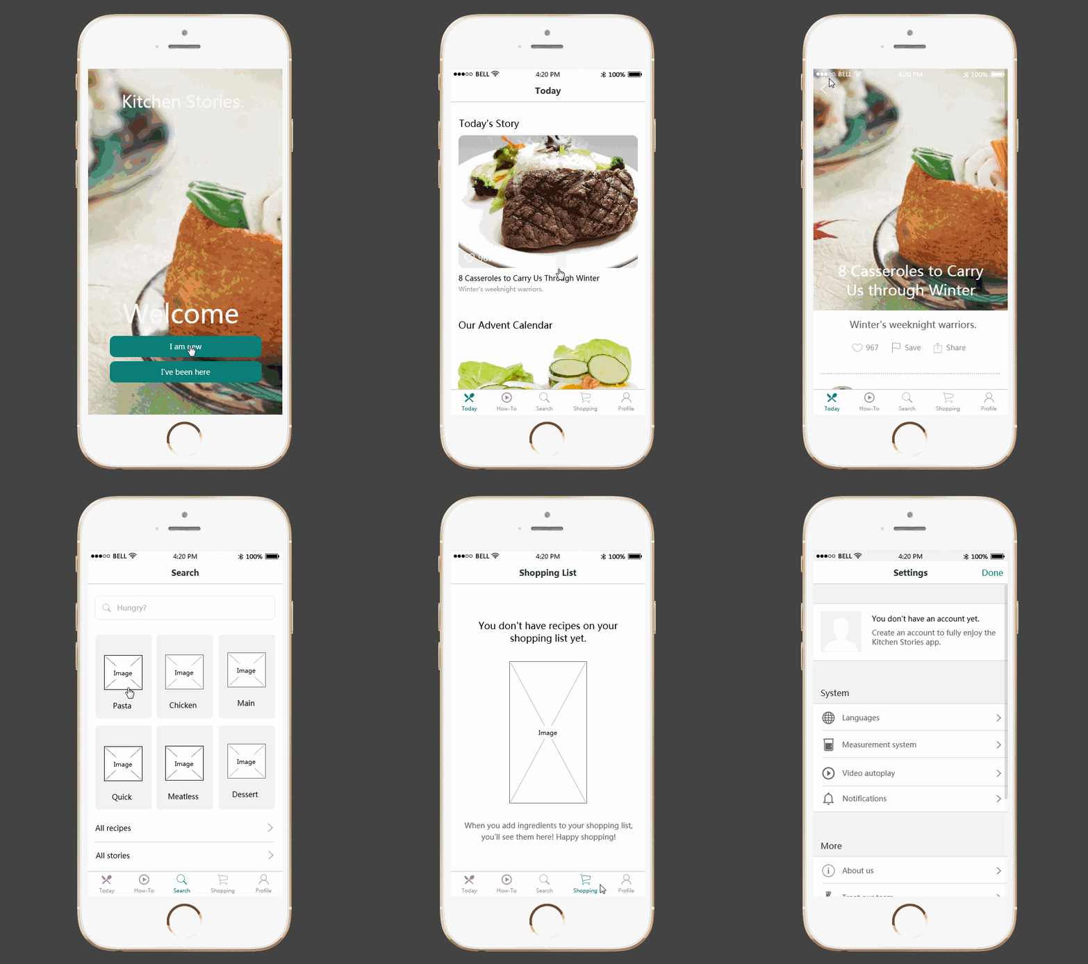
Kitchen Stories is a useful and comfortable food recipe app that adopts various grids to show lots of recommended dishes with beautiful photos. It is really convenient for cooking lovers to easily find their preferable dishes by browsing these recommendations. Of course, if they do not want to try these recommended ones, they can also directly open a special Search page of this food app and seek their favorite food/dishes merely by entering keywords or clicking the shown food categories.
Moreover, except displaying food with well-crafted and attractive pictures, the designer also presents many small videos about how to make a delicious dish or dessert in its special How-To section. This is really a nice shot for users to more intuitively learn how to make tasty dishes/desserts.
And its customized Profile page also allows users to easily save or share recipes freely.
In short, if you also want to design a user-friendly and comfortable food mobile app similar to Kitchen Stories, you can directly imitate this app and adopt its designing skills, such as creating a separate Search page to enhance the searching function of your app or adding some small videos or audios to let the app more attractive, etc.
3. Food Parlour
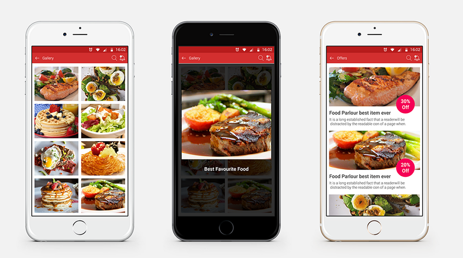
Food Parlour is a unique and easy-to-use food mobile app that is specially designed for a Cafe Restaurant. As a food app customized for a restaurant, except having some common features of standard food mobile apps, such as powerful searching functions, beautiful food pictures and food recipe details, this app also has been combined with some restaurant characters and designed with many extra services/sections to attract users and increase hotel revenue online, including booking a table, locating the hotel, showing restaurant menus/recipes and discount/special offer information, etc.
Moreover, its responsive interfaces are very convenient for every user/customer to choose and order different food with a wide variety of mobile devices freely.
Its modern and fashionable color scheme is also worth trying in your app UI design.
In short, if you are working on a food app especially for a restaurant/hotel/fruit shop, also do not forget to combine some features of this restaurant/hotel/fruit shop, like its industry characters, service features and shop cultures, etc. This is a pretty useful way to make your food app unique and outstanding.
4. Weekend Dish
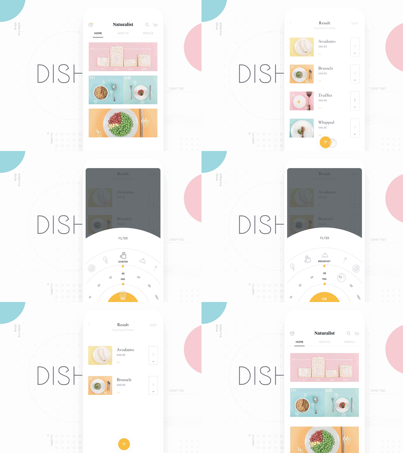
Weekend Dish is a simple and clean food delivery app that allows people to search and order meals, beverages, cafes, ice creams and more tasty food online with simple clicks. And the biggest highlight of this food app is a well-crafted Circle navigation that will pop out when people click a menu button located on its Home page. Each ring of this circle navigation has displayed diverse variables based on user needs so that they can freely slide these rings to choose and order their designed meal quickly online. This is pretty vivid and interesting.
Moreover, its pure white background also matches perfectly with beautiful food pictures. And such simple, clean and neat interfaces are really effective to make the shown tasty food/recommendations stand out.
Overall, in your app UI design, you’d better also add such special visualized navigation designs or related interesting elements to make your design much better.
5. Tasty Burger App
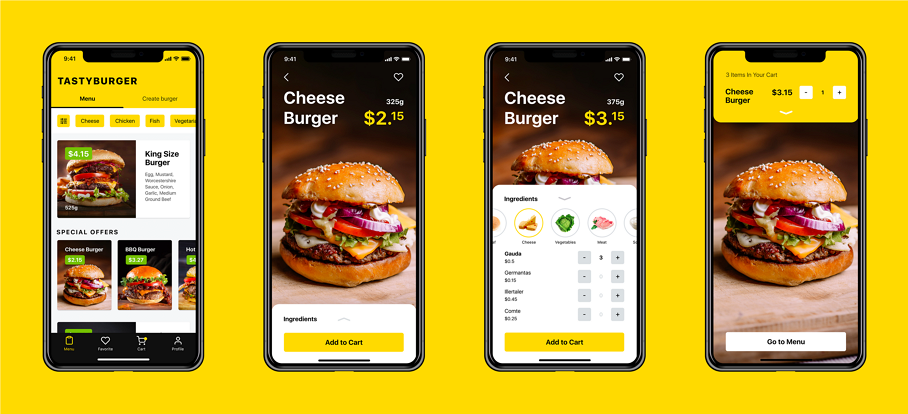
Tasty Burger App is a modern and beautiful food app for users to order traditional burgers from the menu or customize any option for themselves adding or removing the ingredients. It showcases many high-quality and attractive photos of popular burgers to arouse the interests of app users. Moreover, its modern color scheme, black background with yellow and white texts/buttons, can not only echo with the main colors of these attractive burger photos, but also highlight the burger theme of this software. It is really beautiful and fashionable.
Therefore, in your food app UI design, you can also combine the features of different food/fruits and propose a perfect color scheme. This can not only echo with the theme of the food app, but also make the entire app more beautiful and eye-catching.
6. Healthy Food App
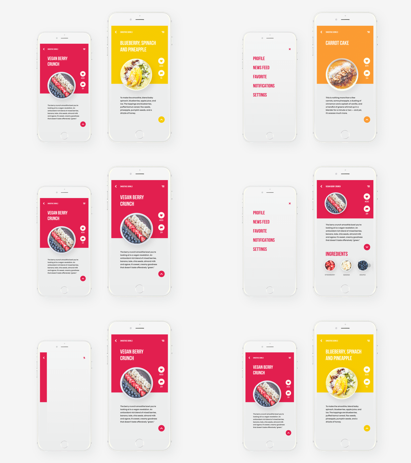
Healthy Food App, as its name implies, is a user-friendly and informative food mobile app that will provide recipes and tips on healthy food. It adopts graphic elements and correspondent color solutions to showcase the listed healthy dishes or recipes in an intuitive and visual way. As a responsive app, it is also could be used and presented on different electronic devices, like android/iOS phones or iPad, etc. Its smooth swiping interactions are also great.
And for me, in comparison of learning its interface design, I just want to emphasize its creative app theme. Nowadays, fast food and junk food can be seen and purchased everywhere. And how to eat better and healthier has become a widespread problem for people. And the designer of this food app keenly grasps this user needs and chooses the theme of introducing healthy food and recipes. This is really creative and unique.
Therefore, in your UI design, you can also analyze the true user needs and choose a distinctive theme for your food app to attract more users/customers.
7. iOS App Food Menu
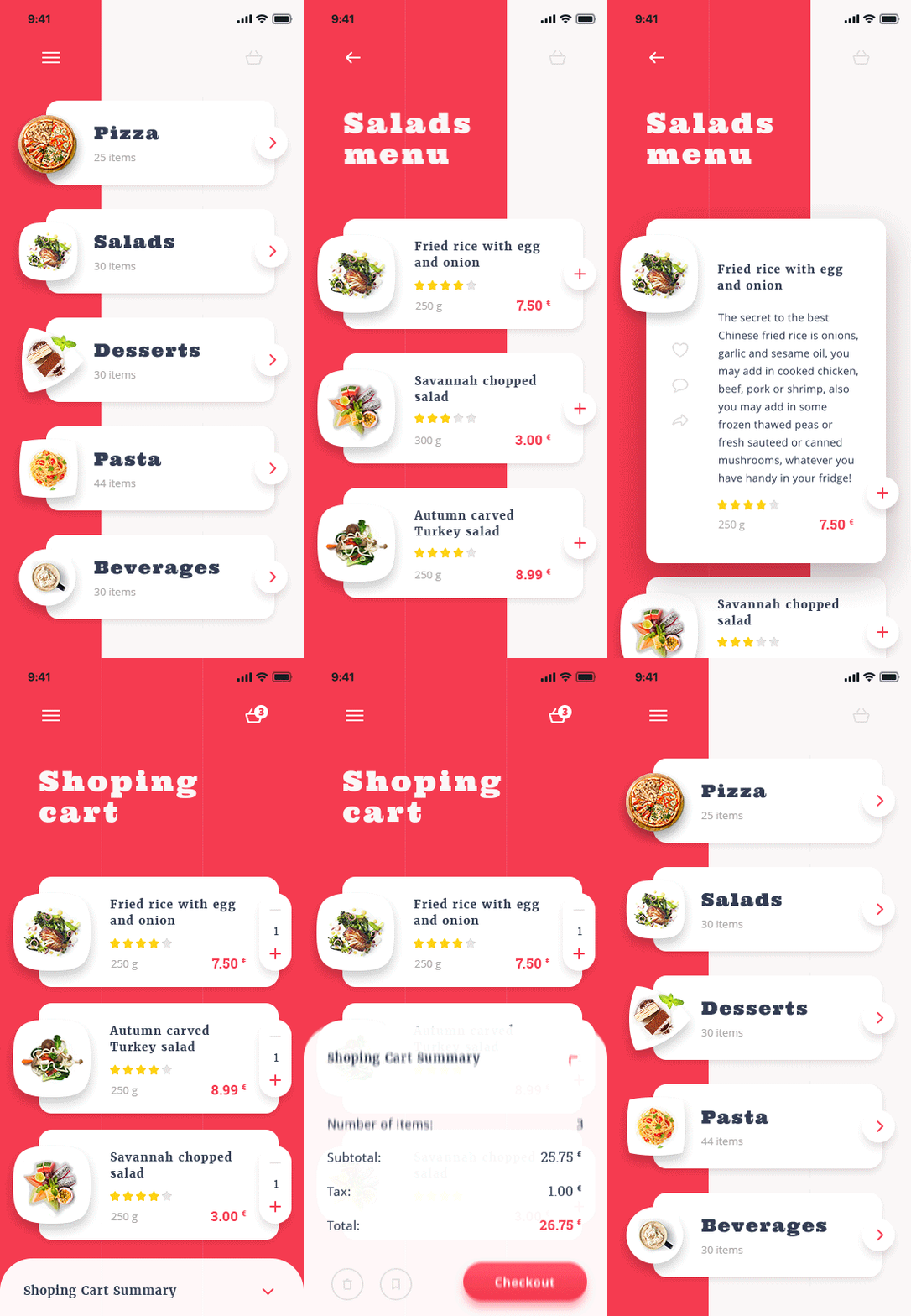
Seriously speaking, iOS App Food Menu is not a complete food mobile app. It is only a part design for the menu of a food app. But, it is also very creative and worth learning.
Firstly, the designer of this app adopts a particularly cool menu, a label-like menu, to showcase all food categories. And then, also uses a unique accordion style to show diverse food dishes after these food category labels are clicked. And while continuing clicking these food dishes, you can also check further details of these delicious food dishes, including the prices, ingredients, comments and more. This is really cool and intuitive. And the underlying logic is also pretty clear.
Moreover, its fast and smart transitions are also very impressive.
Hence, when you are trying to create and complete a unique and cool food app UI design, you can also add such eye-catching elements with a label/liner/tree style. Of course, also spend some time designing a clear logic for your app interfaces.
8. Box8 Food Ordering & Delivery App
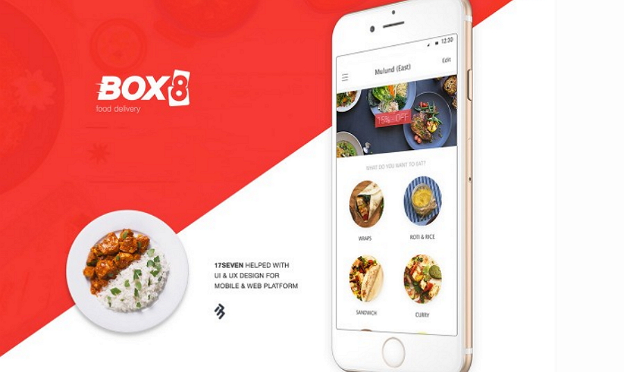
Box8 Food Ordering and Delivery App is a nice food delivery app that is created by 17 Seven studio. It features for its outstanding Side Menu to let users reach various parts of this app with simple clicks. Its sweet grid designs are useful for users to browse and select needed dishes freely.
Moreover, its introduction page at Behance also shares its wireframe and UI flow chart. And they could be really useful for your UI design project.
And, in your UI design, you can also make full use of such sidebars to enrich your designs.
 :
:9. Morning Baker
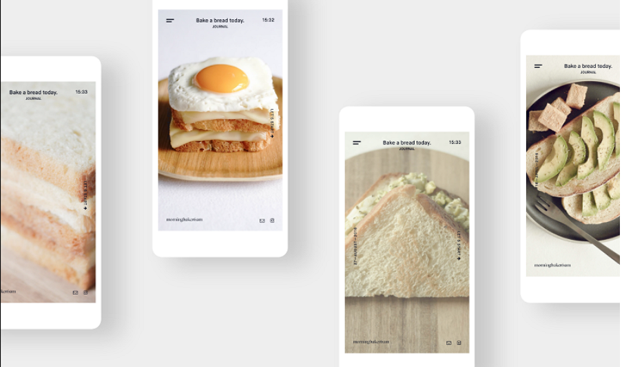
Moring Baker is a simple and neat food app that allows cooking lovers to search all kinds of breakfast recipes, especially some bread baking recipes, and make beautiful and delicious western dishes. And its high-quality photos of diverse dishes, ingredients, and cooking tools in large sizes also match perfectly with shown instructions. This also makes the entire app reveal an artistic atmosphere. So, it is very suitable for some gourmet enthusiasts who love making their breakfast as an art.
And, in your UI design, you’d better also learn to choose a special angel for showing or illustrating your design ideas, such as selecting a special audience or a unique theme, etc.
10. D-Drink App
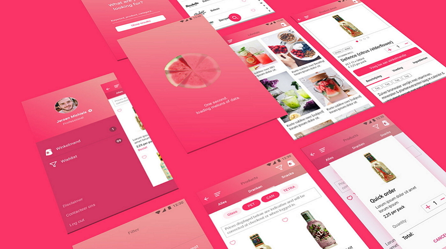
D-Drink app is a simple and cute beverage ordering and delivery app with clean and neat interfaces. Its nice color scheme, pink background with white beverage photos and texts, also make entire app beautiful and fashionable. Moreover, it also has been designed with very special and cute loading pages, which could distract the users’ attention and let them unintentionally wait for a longer time.
So, in your UI design, you can also add such humanistic elements, like cute loading pages, to make users engage with your app content for a longer time.
Overall, this is our list of 10 best food mobile app UI design examples for your inspiration and hope they all can help you somehow.
What’s the Best Prototyping Tool to Help You Design a Beautiful and Interactive Food App?
Get ideas after browsing those food app UI design examples, but still looking for a good prototyping tool to turn your ideas into interactive prototypes and test the feasibility of these ideas? Mockplus, an easy and fast prototyping tool will be the best choice for you. It offers many powerful functions for you to build a beautiful and unique interactive food mobile app prototype:
1). Add images in batch with Repeater of Mockplus
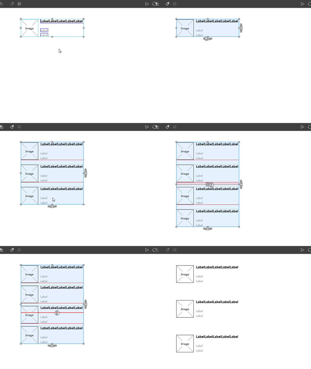
In order to attract more customers, UI designers often add a large number of exquisite and beautiful food photos in their UI design to make app dishes/recipes more attractive. In Mockplus, you can quickly use its Repeater to add Image components in batch for your food app prototype with simple clicking or dragging.
2). Automatically fill numerous food images at once with Auto Data Fill of Mockplus
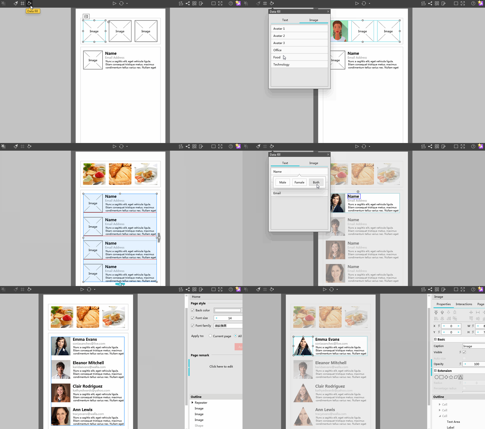
Is it also really troublesome to fill all these food Image components one by one? OK! With Mockplus, you can easily use its Auto Data Fill to automatically fill all selected food images at once with simple clicks.
3). Choose food icons of Mockplus to enrich your UI designs
Adding food icons is also another effective way for designers to create easy-to-use and intuitive interfaces. And, with Mockplus which offers over 3000 icons in different categories, you can freely select and edit needed food icons for your food apps.
4). Create interactions and transitions for food apps with simple drag-and-drop in Mockplus
Interaction designs also make a food mobile app UI design outstanding and attractive. As a faster and easier prototyping tool, Mockplus enables designers to easily drag and drop linking points to create interactions between components and components, components and pages as well as pages and pages. Moreover, its diversified swiping effects are also worth trying.
5). Other powerful functions
Mockplus also offers many easy-to-operate and useful functions for you to improve your food app UI designs, such as team collaboration, 8 ways to preview and share a project, and well-designed project/page templates and samples, etc.
Overall, no matter which type of food mobile apps you are trying to design, this easy and fast Mockplus could be your nice choice to test your ideas and present your app design in a visual way.
Conclusion
In these days, more and more restaurants, hotels or gourmet food stores realize the importance of the internet and choose to customize their own food apps for attracting more customers and increasing their sales online. And this also gradually becomes an overwhelming trend. However, for UI designers, this resistible trend can not only bring great opportunities, but also pose challenges to them, such as requiring more professional UI design skills, and mastering a suitable prototyping tool to quickly test and iterate the UI design ideas, etc. In short, no matter whether it is an opportunity or challenge for you, hope this article, which lists 10 latest and best UI design examples of food apps and introduces an easy and fast prototyping tool – Mockplus, can help you anyhow.
Also read:
Nice publish! Thanks for sharing these useful statistics to us. I'm looking ahead to your new post so, please preserve sharing.We also provide
回复删除Local Listing On Google
Local Business Google
Web Design and Development
On Page and Off Page Seo
Dynamic Website
digital marketing company in delhi
Web Designing Company
Digital Marketing Services
Internet Marketing Services
Web Designing Services
Web Development Company
Website Development Company
website design company in delhi
Mobile Responsive
Mobile Friendly Website